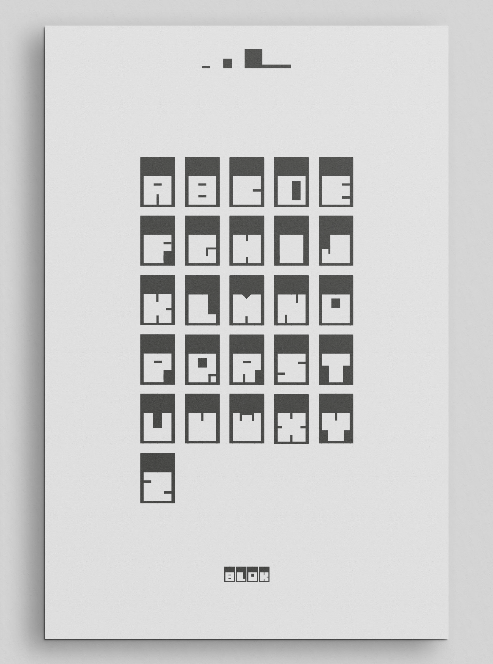
Type Design Project: BLOK Typeface
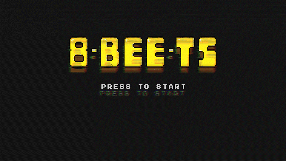
For a university project, the task was to create a modular typeface using 3 to 5 basic shapes, with inspiration drawn from the work of a notable graphic designer. I chose to focus on the geometric, minimalist style of Herbert Bayer, a key figure in modernist design. Drawing from his use of simple forms and clean lines, I developed BLOK, a typeface made up of a series of geometric shapes, such as squares, rectangles, and circles, which give the typeface its bold, structured appearance.
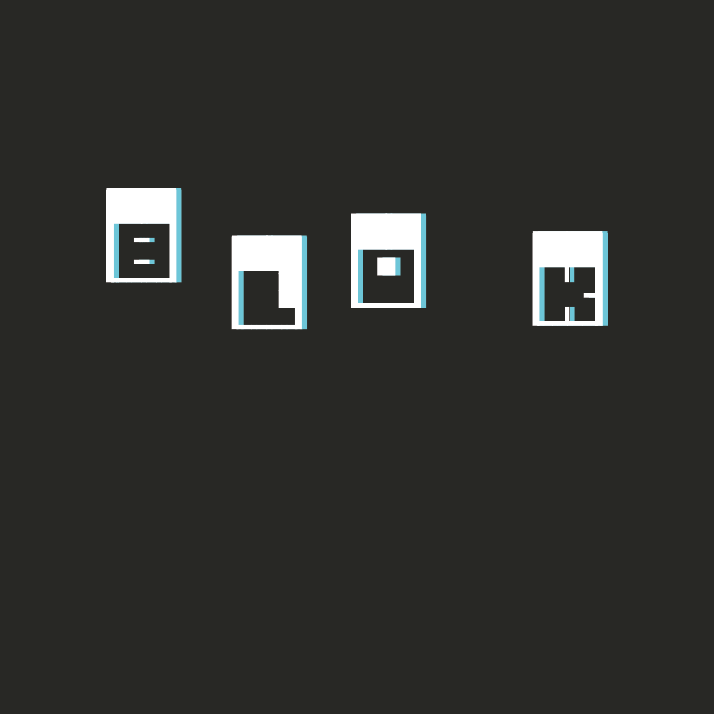
The modular nature of the typeface allows for flexibility while maintaining a cohesive visual identity. Each letterform in BLOK is constructed from a limited number of shapes, creating a strong, blocky feel that stands out. Once the type was completed, we were asked to present it in a creative context. Given the typeface’s blocky, angular nature, it immediately reminded me of the pixelated designs seen in early retro video games. I decided to place BLOK within this context to highlight its digital, almost pixel-like quality, and evoke the nostalgic charm of vintage game typography.
This approach not only reinforced the modernist influence of Bayer’s work but also allowed me to explore how the typeface could be interpreted in a playful, contemporary setting. The contrast between its minimalist design and the retro video game context created an engaging visual narrative, blending the past and present in a unique way. The project allowed me to connect traditional design principles with modern, cultural references, resulting in a typeface that feels both timeless and current.